In today’s digital age, infographics can be powerful tools for educating and mobilizing young people in political advocacy. Visual storytelling can simplify complex issues, highlight key statistics, and inspire action in ways that plain text often cannot. However, infographics can have varying levels of effectiveness based on how the data is presented. In this post, I’ll analyze two infographics focused on youth political engagement. One addresses barriers to voting, and another promotes global youth activism. By examining their design, readability, and messaging, we can explore how well they communicate their message and motivate young people to get involved in shaping their communities and the world.
Infographic #1: CIRCLE’s Barriers to Voting
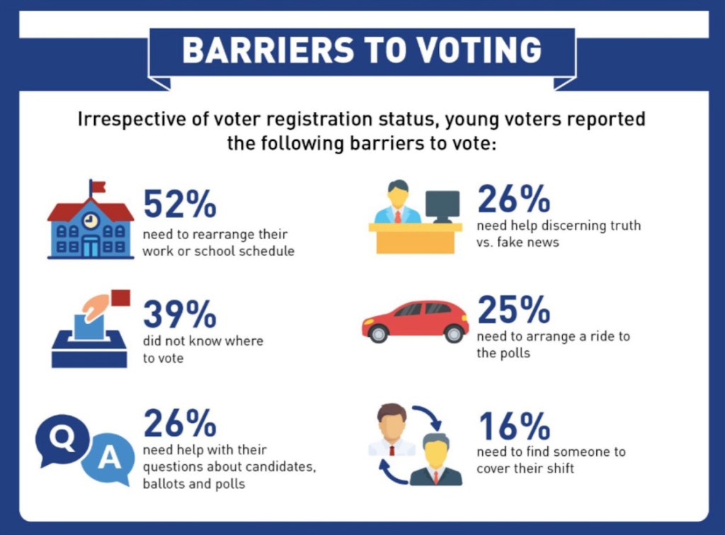
This infographic is super effective visually. It is well-structured and has a clear title at the top that immediately informs the audience of its focus. The layout follows a logical order, with each barrier paired with a percentage and an icon, making it easy to digest. Larger percentages and bold text help emphasize key data points, ensuring that the most important information stands out.
The infographic effectively balances text and visuals, using icons to reinforce each statistic without overwhelming the design. The icons use colors strategically (e.g., a red car for transportation, and a blue school for scheduling issues), making them visually distinct and easier to associate with the data. There’s a good amount of white space, preventing the infographic from feeling cluttered.
It is clear that the infographic’s goal is to inform. However, a more effective infographic might include a call to action. Suggesting solutions could make the message more action-oriented. Adding a small section at the bottom with steps to overcome these barriers could enhance the impact.
Infographic #2: United Nation’s YouthNow Campaign
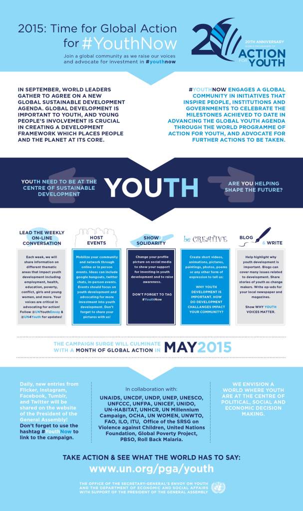
The title of this infographic is immediately effective. The use of the hashtag reinforces the campaign’s social media focus. The sections are clearly separated, making it easy to navigate different ways youth can get involved. Additionally, the graphic contains a call to action at the bottom (Take Action & See What the World Has to Say); this is positioned well, encouraging participation.
The infographic aims to do a lot: explain why youth engagement is important and break down methods of doing so. Because of this, it is packed with lots of information. It provides multiple ways to take action and different methods of engagement to make participation accessible.
However, the infographic is simply too packed with text. There are too many large blocks of text featured, making it hard to digest. Breaking these down into bullet points and including more images, illustrations, or statistics could make the graphic more engaging and digestible, especially to be shared on social media.
How can we learn from these graphics?
Analyzing these infographics provides valuable insights into what makes visual storytelling effective in youth political advocacy. From clear organization and engaging visuals to concise messaging and compelling data, each element plays a crucial role in capturing attention and inspiring action. By understanding these design principles, you can create an impactful infographic that educates and motivates young people to participate in politics. I have been tasked with creating an infographic in one of my classes. Using my analysis of these graphics, I can create a more visually appealing and engaging graphic. I hope you remember this analysis the next time you’re tasked with visual storytelling!

Leave a comment